If you are looking for inspiration for creating a dashboard, then look no further. This blog post will show you 15 of the best Power BI dashboards that have been created to date. You can use these examples as a starting point when designing your dashboard or get some new ideas from them. YOU CAN ALWAYS HIRE OUR BEST TUTORS TO GET HELP WITH POWER BI DASHBOARDS ASSIGNMENTS.
What are Power BI Dashboards?
Power BI Dashboard is a set of visualizations from data that are interactive and collaborative. It allows you to explore the details of your company’s performance in ways never before possible. You can also share these dashboards with others for collaboration, either on an internal network or over the internet. There is no need to export multiple files with dashboard reports or combine them into one via Excel anymore; all the information you want will be at your fingertips straight away!
15 Best Power BI Dashboard Examples
15 Best Power BI Dashboards Examples
1.Airport Authority Performance Dashboard:
This dashboard provides a visual report on the performance of the nation’s airports, including long-term and short-term goals. The data used in this Power BI dashboard is pulled from both public sources such as the Bureau of Transportation Statistics and Air Traffic Control System Command Center (ATCSCC) to airlines themselves. This includes airport operation information such as arrivals and departures, security checks, baggage handling, or airline operations like delays or cancellations due to weather conditions.
While some parts are more detailed than others (e.g., detail about specific flights), it still provides an excellent overview of how many passengers flew through each airport in any given year with a graphical representation that makes finding trends easy! With all the information you need at your fingertips, this dashboard is an excellent way to get insights into how the airport function.
2.Customer Analysis Dashboard:
This dashboard provides a visual report on customer analysis. The data used in this Power BI dashboard is pulled from internal sources, including marketing campaigns and CRM databases. This includes information such as the number of customers acquired or lost by campaign type, what percentage of those customers purchased within 30 days after receiving an email message etc. With all these details at your fingertips in one single report, you’ll be able to understand how well various marketing channels are performing, for instance!
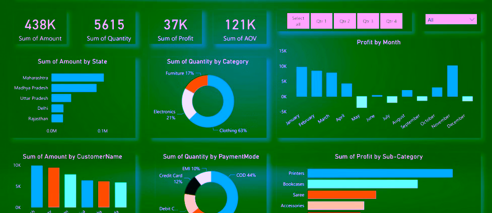
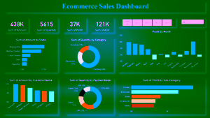
3.Global Superstore Dashboard:
This dashboard provides a visual report on the performance of a global retail company. The data used in this Power BI dashboard is pulled from internal sources, including CRM databases and information such as product availability or customer service tickets per store. This includes graphs displaying an overview of sales by region, sorted by any column when needed! With all these insights at your fingertips, you will quickly find out how well-suited your overseas markets are to each other and whether their needs differ significantly depending on location, leading to optimized approaches that help bring up market share abroad!
4.Cancer Analytics Dashboard:
A cancer analytic dashboard is a great example of how Power BI dashboards can help you better understand the data and make decisions based on it. The data used in this Power BI dashboard is pulled from public sources such as National Cancer Institute.
5.Pharma Sales Analysis Dashboard:
This dashboard provides a visual report on pharma company performance. The data used in this Power BI dashboard is pulled from internal sources. The data is presented in graphs displaying an overview of sales by region (the US versus Europe), sorted by any column when needed! With all these insights at your fingertips, you will quickly find out how well-suited your overseas markets are to each other and whether their needs differ significantly depending on location, leading to optimized approaches that help bring up market share abroad!
6.Human Resource Dashboard:
This dashboard provides a visual report on HR performance. The dashboard is used to analyze the performance of HR teams and employees. A good example is employee turnover rates, which are calculated by comparing how many people left the company against those who joined it over a certain period. This data comes from internal sources such as ERP databases or CRM databases, for instance!
7.Executive Insight Dashboard:
This dashboard provides a visual report on organizational performance. Information obtained from this dashboard includes executive demographics, such as age or gender. It also provides insights on the location of these executives and how much they work per month, for instance!
8.Electricity Usage and Cost Dashboard:
This dashboard provides a visual report on electricity usage and costs at an office. The dashboard is used to analyze electricity usage and cost for different regions. The data is pulled from internal sources like CRM databases or ERP systems, which can be analyzed in Power BI!
9.Inventory Stock Analysis Dashboard:
This dashboard provides a visual report on inventory stock. Information obtained from this dashboard includes metrics such as which items are running low in stock, sales by month, and the distribution of customers. It helps you to understand the data better and make decisions based on it.
10.Sales Scorecard Dashboard:
This dashboard provides a visual report on the sales scorecard. The sales scorecard dashboard helps you understand how well you are doing in the market, which is a great way to benchmark your progress over time.
11.Social Media Monitoring and Analytics Dashboard:
This dashboard provides a visual report on social media monitoring and analytics. It makes it possible to see the social media chatter about your brand, or a single product for that matter. You can also filter by any criteria and drill down to see more details, such as location level data of users tweeting from their smartphones!
12.Attendance Tracker Dashboard:
This dashboard provides a visual report on the attendance tracker. It helps you understand how well you are doing in the market, which is a great way to benchmark your progress over time.
13.Team Performance Vs. Target Dashboard:
This dashboard provides a visual report on team performance vs. target. It helps you understand how well your teams meet their targets, which is a great way to benchmark them over time!
14.Seattle’s Construction Climate Dashboard:
This dashboard provides a visual report on Seattle’s construction climate. It helps you understand the environment in which your team is working, whether it be for residential or commercial purposes, and what needs to be done differently to optimize success!
15.Mobile App Usage Analytics Dashboard:
The mobile app usage analytics dashboard allows for insights into users’ behavior by tracking and analyzing how they use it. You can easily monitor your team’s performance with this dashboard, which is a great way to benchmark their progress over time!

Do You Need Help in Creating Power BI Dashboards?
If you are looking for someone to help you develop a Power BI dashboard, we have a team of experts who can help you. They will take you through setting up from beginning to end, and they will also help you with any other project that needs assistance.